Hi everyone, long time no see! Our last blog post was in October 2022, and whew, that's... quite a while ago. We haven't sat still in the meantime, though, and I figured another update is long overdue. Let's get to it!
The Elora
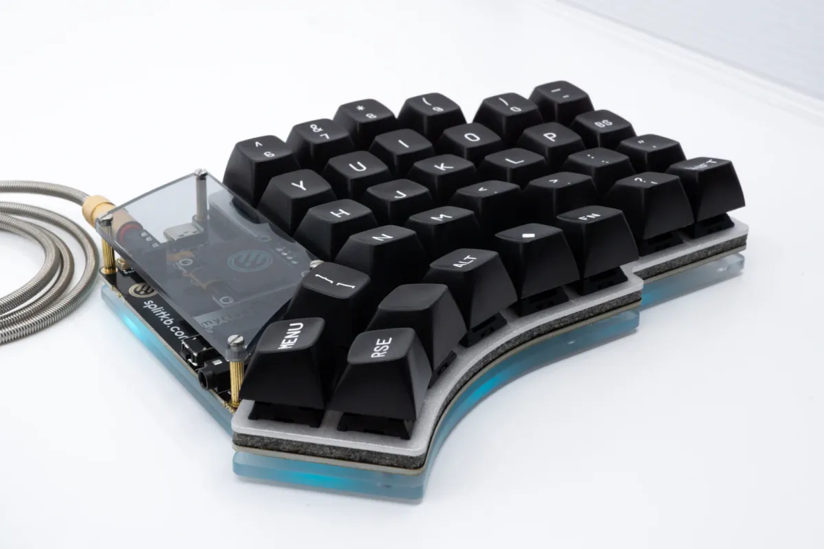
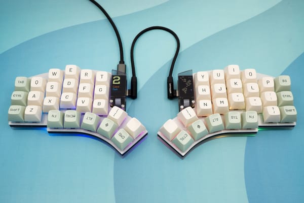
Arguably the biggest thing we've worked on since 2022 is the Elora. It's our first mostly-preassembled keyboard, requiring no soldering at all. You'll only need a screwdriver to assemble the case!

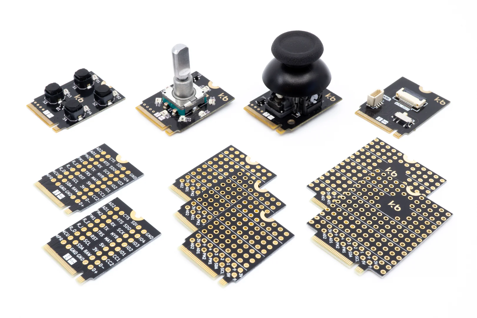
The Elora uses so-called Myriad modules, which are M.2 form-factor cards that you can slot into a connector. They allow you to add functionality to your keyboard without having to solder, too. Various modules are available, such as a joystick, rotary encoder and a tiny macropad.
While we've tested the waters with preassembled keyboards in the past (with the credit-card-sized macropad Zima, which is no longer available), we never really went as far as making a full-fledged product.
It's why the release went rather silently: I wanted to experience the production and reception of the product without putting much pressure on myself and our team. We've learned a lot about (semi-)automated hardware testing and quality assurance, as well as what's required to properly make a product ready for release. We'll apply those learnings to provide for smoother launches in the future, though this launch was still pretty okay overall 🙂 Due to the low volume, we were able to properly care for all customers and resolve most issues that popped up.
The one remaining issue is that USB C connections don't work with a fancy USB C 3.0 cable, though it does work with a less-fancy USB C 2.0 cable. We narrowed the issue down to an ESD protection chip on the CC lines causing an unexpected voltage drop, which causes negotiation to fail when using a more capable USB C cable. USB C to A cables don't seem to be affected at all. Unfortunately this isn't fixable in the firmware, so we'll fix this issue in a new revision, likely ready by the end of 2024.
Trustpilot
Man, the last year or two have been super hectic for the community. Many vendors have gotten either themselves or others in trouble, especially with group buys not being fulfilled and orders not being shipped.
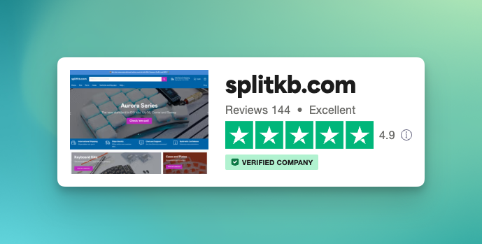
In an effort to prove to the community that we're genuine and try our very best to keep people happy, I set up a page at Trustpilot where you can read reviews people wrote about us, and where you can of course write a review of your own to share with others. Our score (which sits at 4.9 out of 5 at the moment, out of 144 reviews) proves that we usually succeed in making others happy. I'm glad!
Of course, we sometimes do miss – I'm still working to improve response times to tickets, especially the technical ones. That is mostly a problem to do with me personally, as I want too many things and my workload is probably too high as a result. But I'm definitely trying my best, and as the score shows, I try to do right with everyone and do succeed at that frequently 😌
If you're one of the few still waiting for an answer, please rest assured that you'll receive a satisfactory answer before long. Thank you very much for your continued confidence in us!
Upgrades, people!
We pride ourselves on our documentation and helpful tools. While they were pretty good when we started out with them, a few years have passed since then and I felt like it could all use a little more love.
As such, I've been (and still am) hard at work upgrading our current websites! As usual I vastly underestimated the work involved, and as usual it'll be very pretty once it's all done 😌
I plan on releasing these new versions along with a new product release later this year, on which I'll give a little sneak peak later in this article. For now, I'll share some screenshots and background information on the various upgrades.
Our documentation site
Our current documentation site runs on Zendesk Guide. It's pretty expensive for what it does, and the one main benefit is that it integrates nicely with Zendesk for customer service, but that's really about it.
I felt like it could do a lot more! It is a static website based on Nuxt.js and a NuxtUI documentation template. Even though it's a template, a very considerable amount of work still went into tweaking various features and adding new ones. If I were to start over, I'd probably build it from scratch instead, but here we are 😉
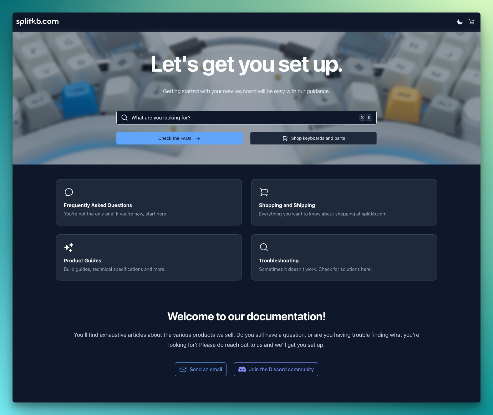
The homepage is pretty similar to the current one. Most notable is the availability of a dark theme, which is set based on your system preference and can be toggled manually, too. There's also a new search function, which is more prominently available and will be more intuitive than the old search. I'm planning to integrate Algolia DocSearch in the future, so that it'll support fuzzy search too - it can be rather strict at the moment.
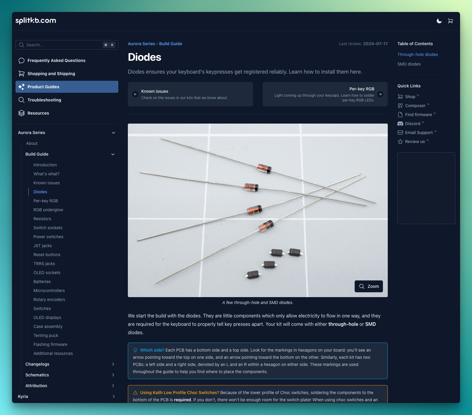
The biggest changes are on the pages themselves. A quick list:
- The main navigation in the top left allows you to quickly get to the right section, and keeps the detailed list cleaner as it'll filter the list to show only pages in the current section. The search bar is also available here.
- The page tree on the bottom left allows you to see all articles in the current folder, and also allows folders to be nested. On our current site, you had to visit another page to see the full folder's contents, and it was harder to gauge your progress while working with a guide.
- The main layout sees quite a few changes:
- You can now link to individual headings by clicking on them. At last we can finally point people to the exact section they need, even on long pages.
- It now has cleaner navigation buttons at the top and bottom of the article, allowing you to easily move between pages. In our current site, we had to add links manually.
- Pages have review dates, and we have a nice overview in which we can see pages that are due for a new review. We'll be better able to keep documentation up-to-date this way.
- You can now zoom in on images, and images are optimised for size when not zoomed in so that pages load far faster and consume vastly less data.
- Images now all have captions, providing more clarity on what's being shown and why.
- The sidebar on the right has a table of contents, allowing you to quickly skip to a section. That's especially helpful on long pages! It also has a few quick links, and there's a spot where we can put a banner of sorts. Gotta hustle 😎
There are also some changes that aren't shown. Steps in a guide that are optional are marked as such clearly below the page's title, explaining when you should follow the step and whether you can postpone it until later. Pages that haven't been reviewed lately show a notice that they may contain outdated information and where to ask for help if you need it. And if you share a link on social media such as Discord or Reddit, our links now feature social previews where the image displays the title and subtitle. Especially for frequently asked questions, we try to put the summary in the description already, so reading just the preview might already be enough.
Next to all the functional changes, we're also tidying up the docs: pages are moved to sections where it makes more sense, like bundling the schematics in the same folder as the actual product. I'm also reviewing all the documentation and reworking it with additional descriptions, image captions, updating any dead links, fixing inaccuracies and adding helpful content where I can think of it. That's proving to be quite a crazy amount of work, but it's something we can be very proud of once more when it'll be available 😁
The Composer
The current version of the Composer launched around January 2023, as mostly a proof-of-concept version. Since then, it's seen quite a bit of use, and people seem to really like it overall.
The Composer however wasn't really finished. I wanted to add more context to the various steps, as a way to actually guide newcomers through the steps instead of mostly showing them the options and how they compared.
Next to that, I wanted products to load dynamically instead of being partially hardcoded. Stock information as well as pricing did update live, but I want it to display new options without having to update the code, too.
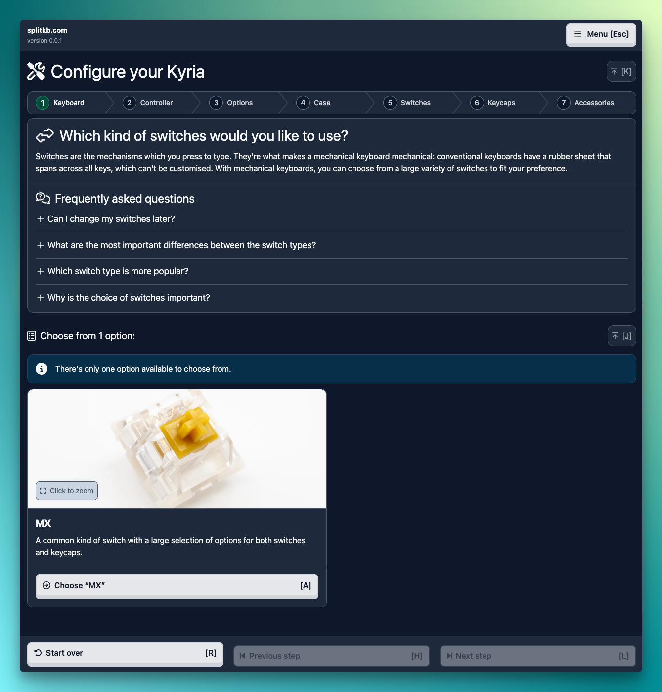
The composer will have a dark theme, just like the documentation site, though a white theme won't be available at release. All steps will all have a more elaborate description, as well as a frequently asked questions section which provide more context on the current step. Step progress is shown more clearly, so you'll know roughly how much longer you'll have to go before you get presented with the final list of parts. And you'll be able to zoom in on images, which can provide quite a bit more detail than the small previews we have now.
The main page will provide downloadable layout testers for all of our keyboards, and will have a little questionnaire you can use to narrow down the list to those that match your preferences.
Lastly, you'll be able to use the keyboard to navigate through the entire Composer. I thought that would be a pretty neat addition! 😁
The Firmware Finder
Last but not least, we have a Firmware Finder tool which also released in early 2023. Much like the current Composer, it's functional, but leaves a bit to be desired.
The new Firmware Finder is lifting on many of the improvements made to the Composer, featuring a very similar layout. Next to a big ol' list of files, you can now narrow down that list to just the files that apply to your keyboard and preferences using a few quick questions. Easy!
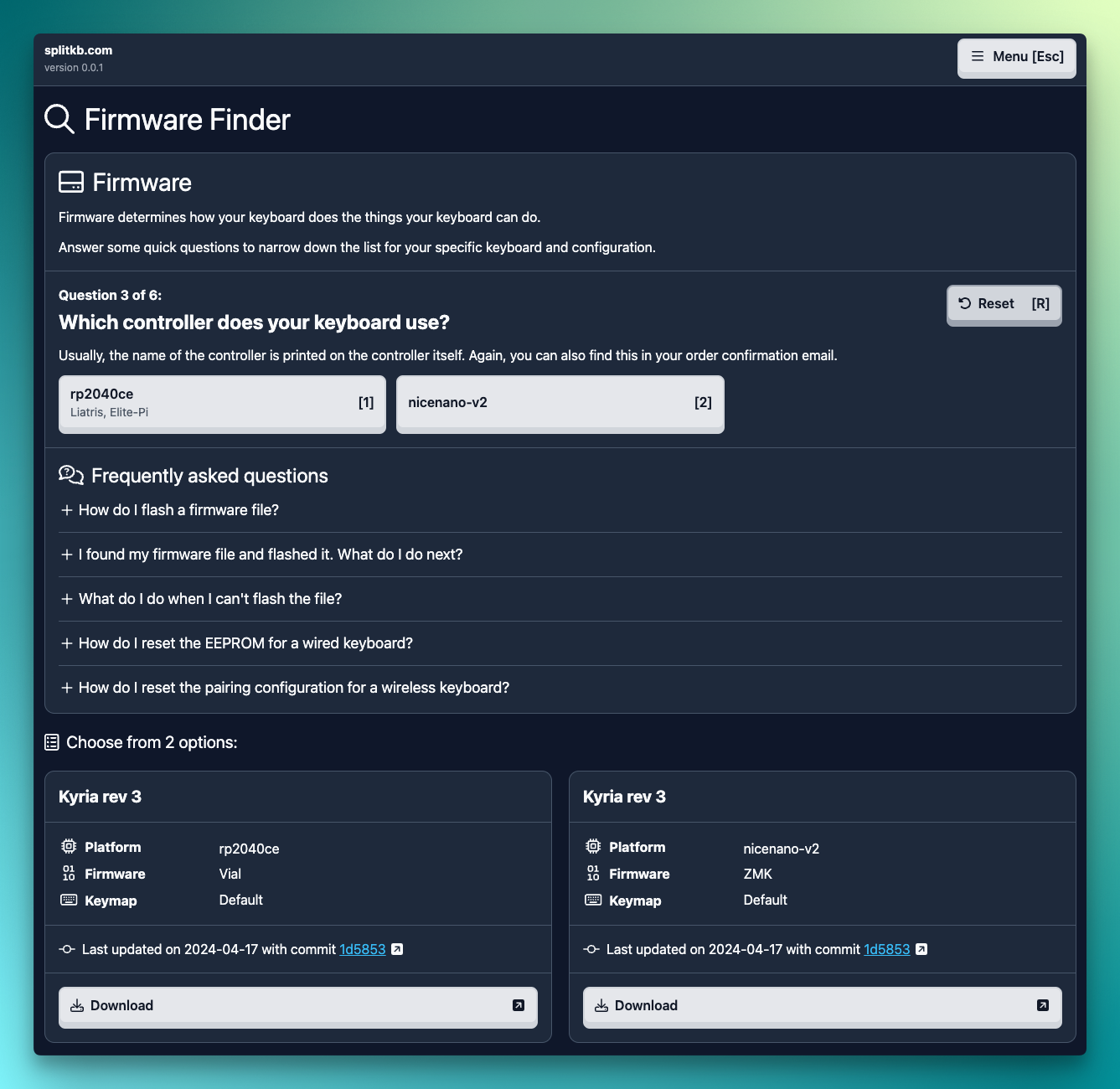
There are some niceties, like the questionnaire skipping questions if they don't affect the selection of resulting files.
On the back-end side of things, we're making it so that changes to the firmware's code on our side will automatically trigger a new build and push that file to the firmware site. To update a file at the moment, we'd need to rebuild the site, which in turn rebuilds all firmware files at the same time. As we continue to get more variations, those builds will take ever longer, so I figured it'll be a worthwhile improvement.
The Halcyon Project
Drumroll!
The release of the Elora was highly anticipated, with over a thousand people on the mailing list. However, life happened, and its release was delayed by around two years. With my dislike for the group buy model, I held off on opening up preorders even though people expressed their enthusiasm. However, the long delay still made some people unhappy, as their patience was being tested.
To prevent that disappointment from happening again, I've resolved myself to not share much detail on new development until it's just about ready to go. Thankfully, we're quite far along in the development of a new project: Halcyon. It's almost ready for production!
Harvey is currently hard at work documenting the assembly process (which doesn't involve any soldering!), as well as how to customise the firmware. I'm hard at work updating the websites outlined above, as well as working on the kitting setup, ordering process and packaging material.
The firmware is already fully tested and functional, both in QMK and Vial, and you'll be able to personalise your keyboard with the QMK Userspace feature, for which we're providing a template as well as documention so you can set it up without any hassle.
So... what actually is it? While I won't reveal the keyboard itself, I will reveal some technical details 😉
First off, the controller breakout board. It's based on the RP2040, which also powers the Liatris controller. It features similar specifications as the Liatris, with a few notable additions: it boasts ESD protection on all GPIO pins, which should provide adequate protection against the occasional zap. No controller which is currently used for keyboards has that. While most people don't experience ESD issues, it can be a pretty awkward problem to encounter, so this will be our attempt at solving that.
Next to that, the controller is hot-swappable using special mezzanine connectors. This allows you to install the controller without having to solder or desolder, so you can upgrade it in the future without having to swap out your full keyboard.
We've taken great care in designing the pinout of the controller, as to make it possible to create a wireless version in the future. As designing a wireless board is outside of my capabilities, I'm planning to outsource its development to a dedicated engineering firm. We haven't started on that yet (it's quite costly 😉), it's definitely on my wish list!
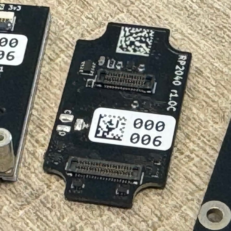
The dimensions of the controller are similar to that of a common Pro Micro, making the form-factor compatible to be ported over to our Aurora Series keyboards in the future, too. Nice 😎
Next up, we thought up a new kind of module to be compatible with the small form factor controller. With the release of the Elora, we thought up the Myriad system. It's quite great, and very capable! But it also requires very drastic changes to apply to a new keyboard, like a custom matrix implementation along with many extra hardware components.
This new set of Halcyon Modules are an implementation of Sadek Baroudi's VIK system. It exposes pins to enable SPI, I2C, digital and analog read, as well as supplying 3v3 and 5V power, all through a small, 12-pin flat cable. While we don't conform to the current module footprint, we will open source a template module and will document the specifications, so it'll be easy for others to also make modules that will fit on the new keyboard.
A quick colour demo of the Halcyon RGB TFT LCD display. That's a lot of acronyms!
Among the modules available at release are a 135x240 pixel colour display, a cute rotary encoder module and... a Cirque trackpad, with a nice housing to make it look super-sleek! Trackpads and other pointing devices are slowly but surely becoming more available, and with this new trackpad module, you'll be able to add it to your keyboard without any soldering.
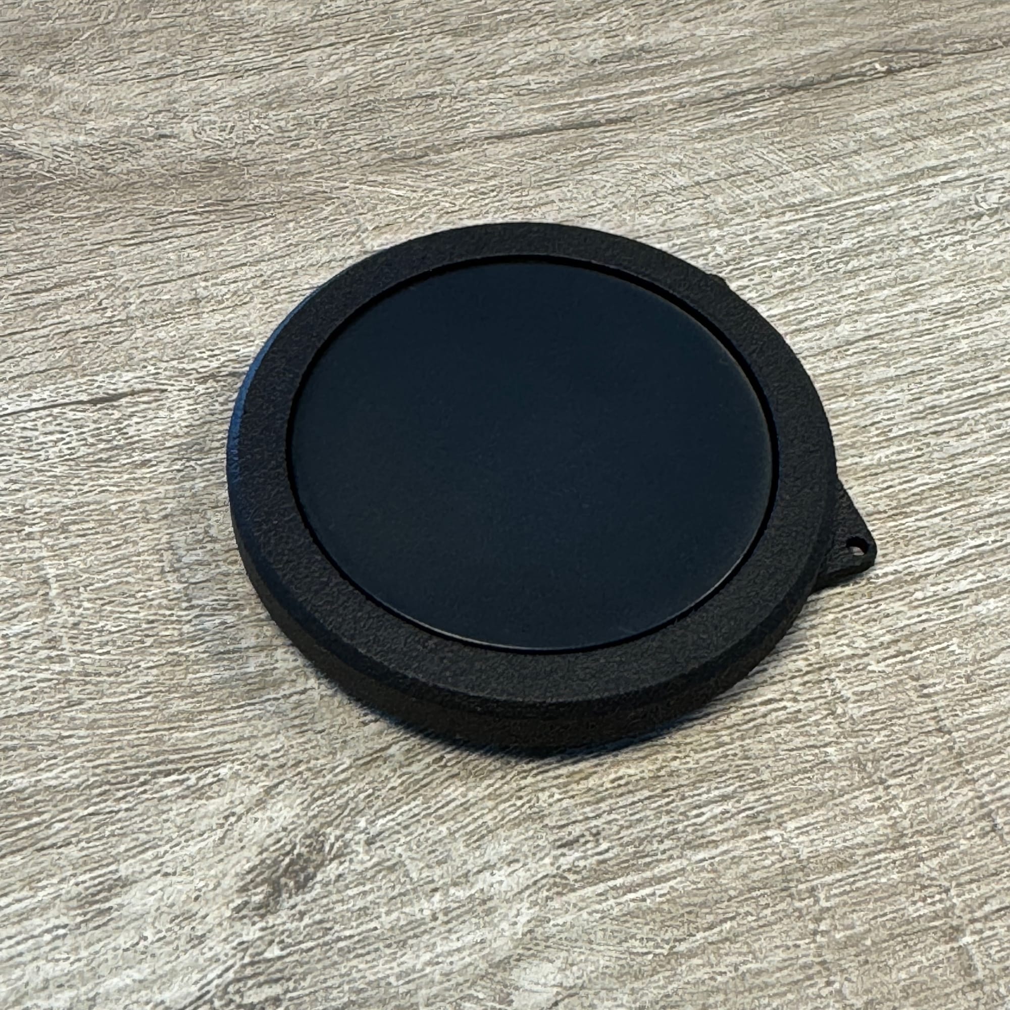
Of course, firmware support will be available out of the box using Vial, where you can select a matching set of firmware files using our new Firmware Finder. And if you'd like to compile your own firmware, we'll provide detailed instructions on how to set up your very own Userspace so you can adjust only the things you need.
Summer holiday
As the two wise men MC Miker G & DJ Sven once rapped:
We are going on a summer holiday
If you want to go, yo, Sven
We're going to London and New York City
And we take a little piece of Amsterdam (right)
Ah, the summer holiday! A lovely time of year where the kids get time off school, and people go somewhere else for a while to take a well-deserved break from their busy work and education.
During this time, our availability will be less than what you might be used to. Our team is already pretty small, so people going away for a holiday will impact our work somewhat.
Next week, from the 5th to 11th of August, orders and answers to customer service tickets may see slight delays. Then, for the remainder of August, we should be keeping up pretty well, but will still have less availability than usual. We're back at our full staffing by September once again.
As for myself, I'll be going on a holiday next week as well, from the 5th to the 9th of August. I probably should take an actually decently long holiday next year, as the last time I was off for two consecutive weeks was... probably over five years ago, before I started splitkb.com. I'll do my very best to answer all remaining questions before I leave, and I'll likely be around Discord regardless 😉 With a bit of luck, I'll have arranged things better next year to take a longer holiday at last. Whew!
Closing words
All in all, despite well over a year without a blog post, we definitely haven't been sitting still! Be sure to subscribe to the mailing list to get an update once our new project is available for sale. Also be sure to join our community on Discord to chat with other keyboard enthusiasts.
Thank you very much for reading all this, and thank you very much for all the enthusiasm and cool build pictures you keep sharing. It's what makes my work fun to do, and I couldn't do it without all of your involvement. Let's keep up the good work, and see you next time! 😁

